Uppercase Magazine

Mid-February, I saw a post in one of my MATS (Make Art that Sells) Facebook groups about there being a call for submissions for Uppercase Magazine's Surface Pattern Design Guide.

Fellow MATS-mate Jan Avellana's artwork is on the cover. Beautiful. There's something about the icons that bring to my mind Matisse and Alexander Girard's work, but in a fresh and new way. I love the color scheme she came up with as well.

Fellow MATS-mate Jan Avellana's artwork is on the cover. Beautiful. There's something about the icons that bring to my mind Matisse and Alexander Girard's work, but in a fresh and new way. I love the color scheme she came up with as well.

I was surprised that the deadline was THAT day, but I scrambled onto the computer throughout the day to crank out some patterns from some art I was working on at the time for my Trends Online Class Workshop through Design Garden, plus some work I completed for MATS.

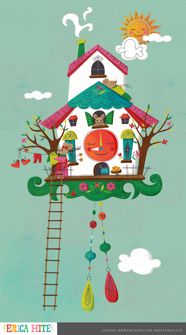
Long story short, some of my designs were accepted! Below, you can see the designs I submitted and a video that highlights some of the patterns in the guide. Oh, and if you're interested in subscribing to this inspiring magazine, discount code 'USPDG2014' will get you $15 off. Click here to subscribe. Also, keep scrolling to see the art I submitted and some related sketches.

At about 3:05, three of my submitted designs are shown in the video.

1-mousecamp_lg.jpg
2-fireflies_lg.jpg
3-folktribal-butterflies_lg.jpg
5-folktribal-mix_lg.jpg
7-folktribalfloral_lg.jpg

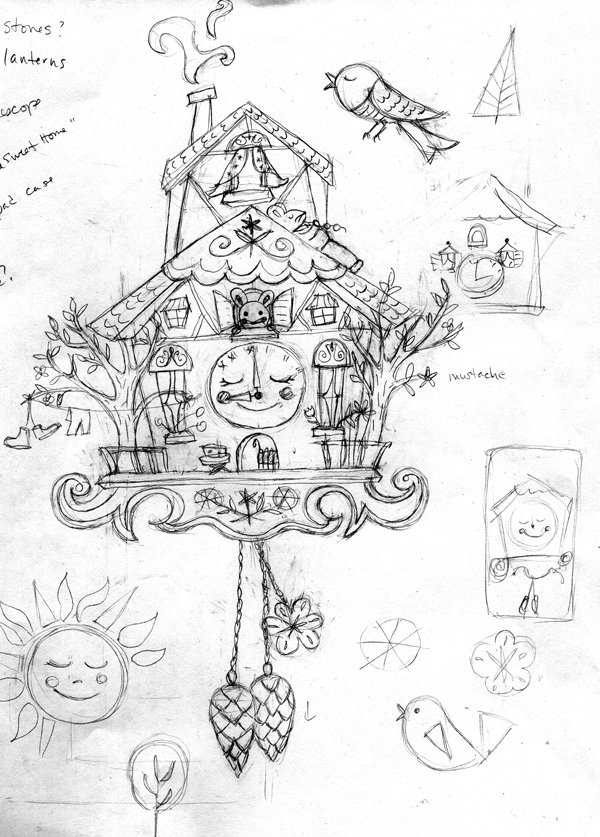
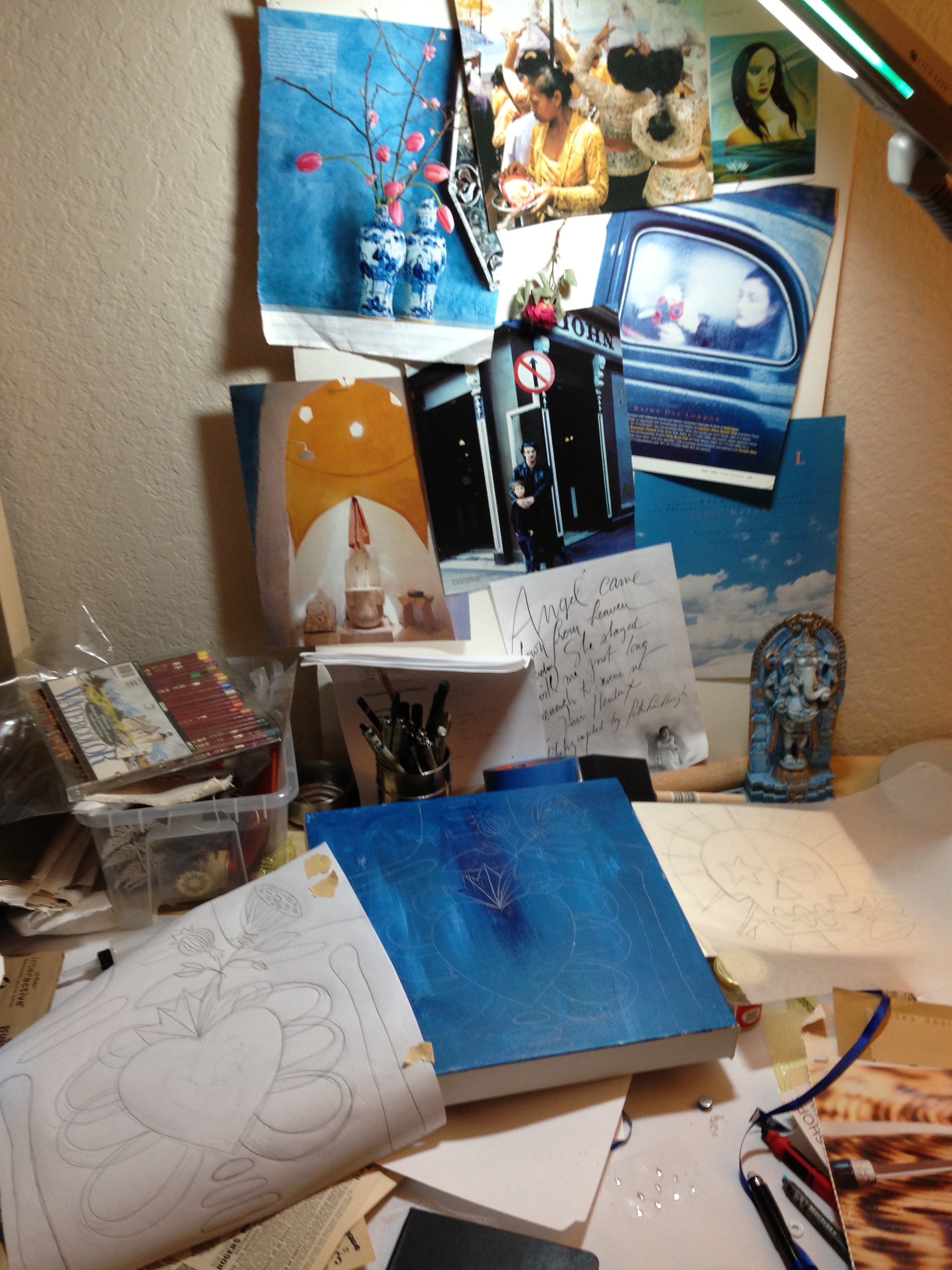
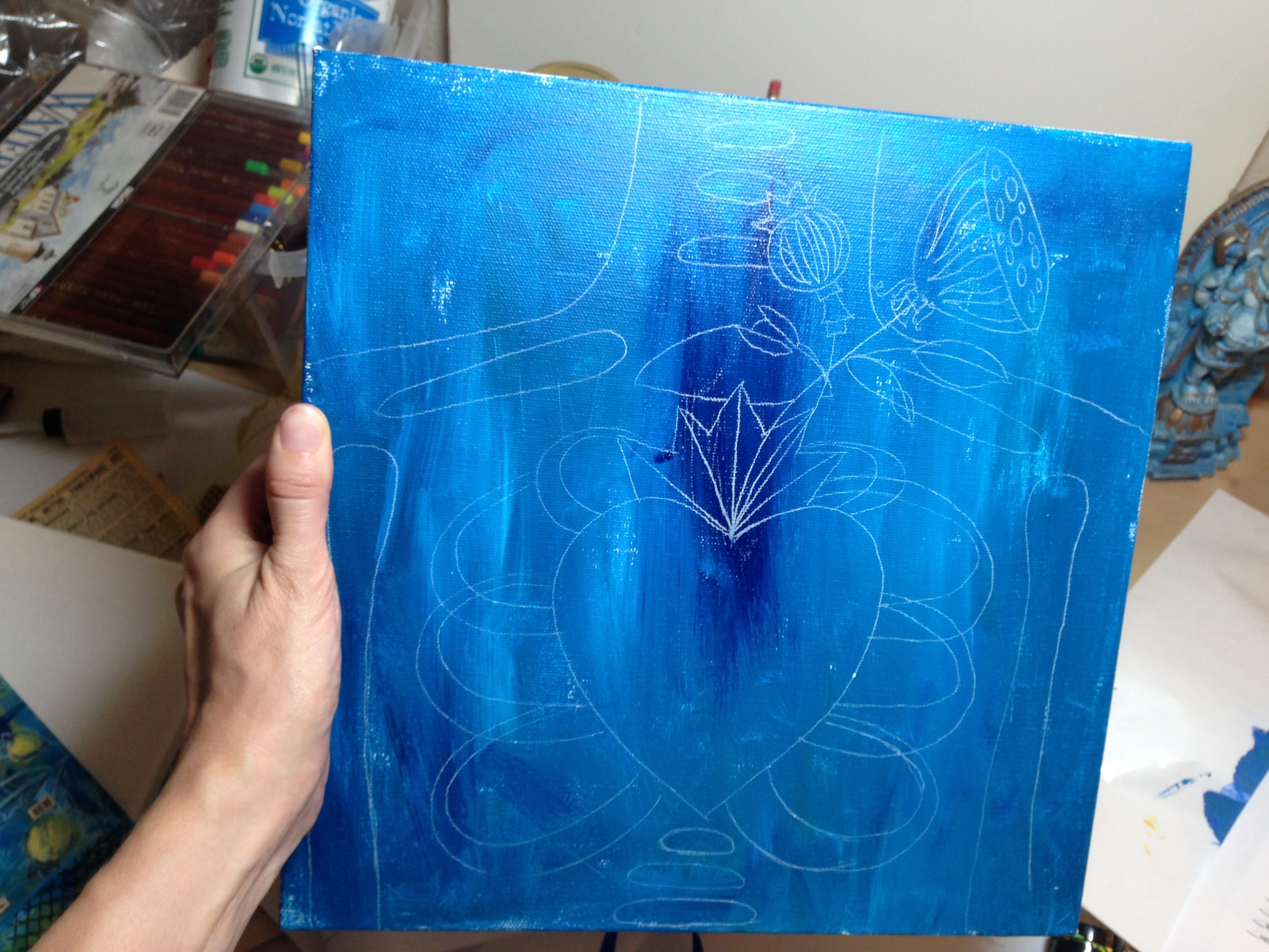
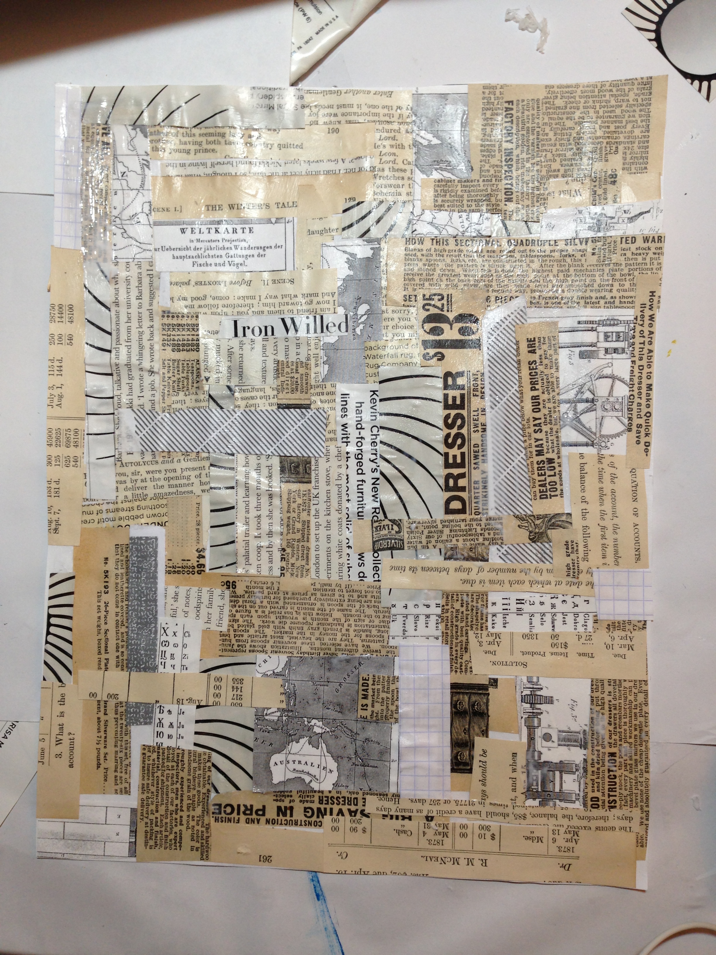
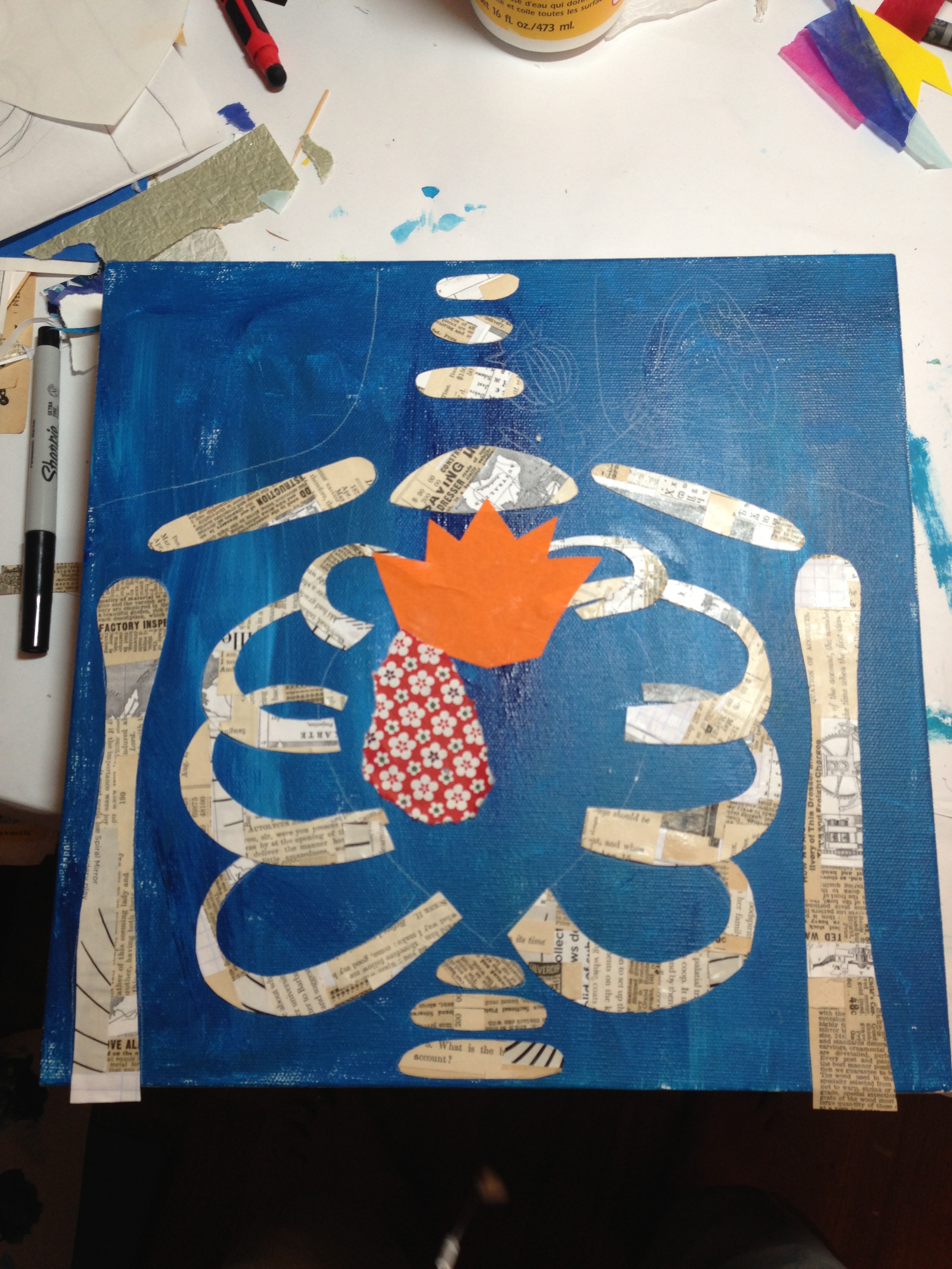
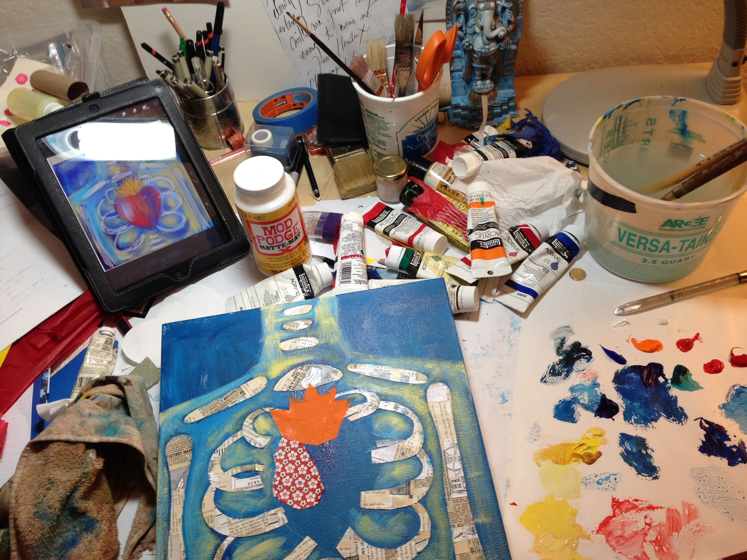
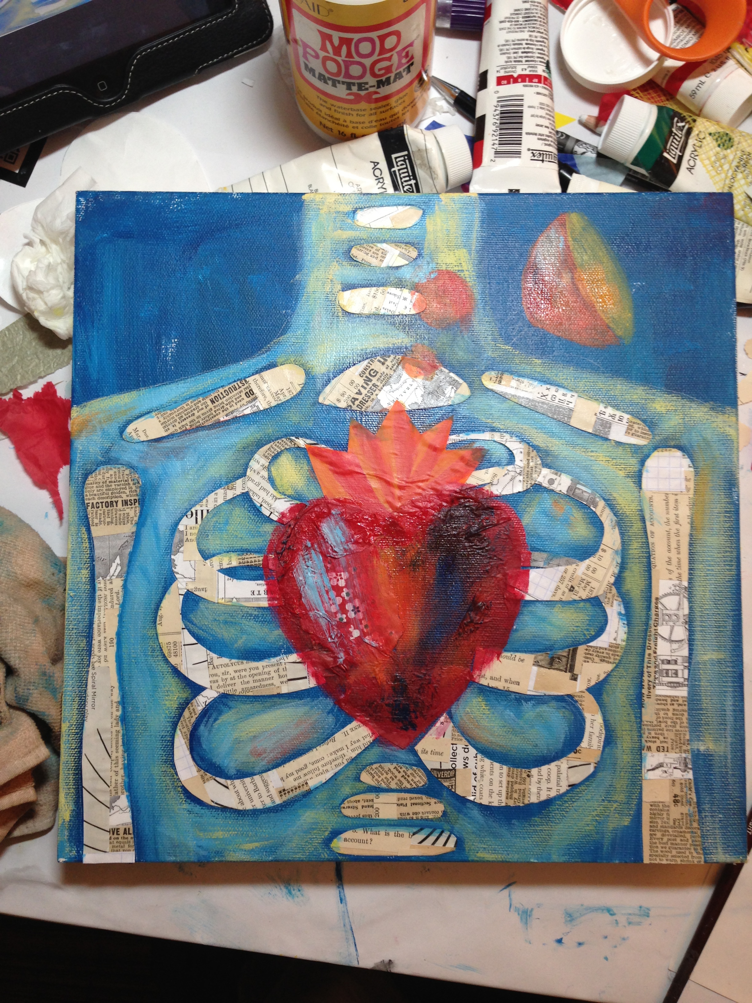
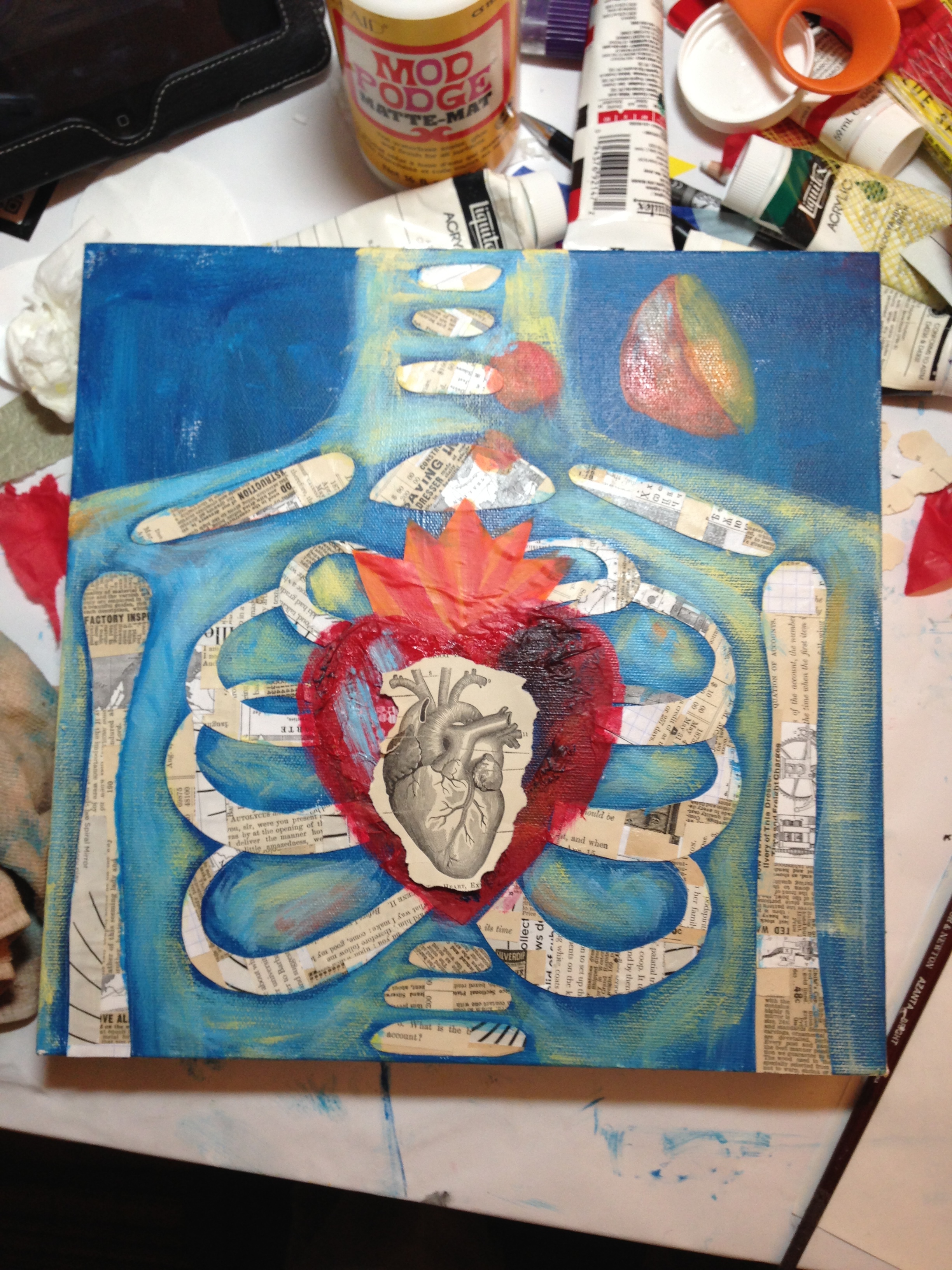
The following are some sketches of art for the last 3 pattern designs I submitted. I worked on them during my Trends Online Class Workshop with Design Garden while I was sketching imagery that combined the folk art and tribal trends. I'll be posting about that class in the near future with more sketches and finished images.

dg_week2003_sm.jpg
dg_week2004_sm.jpg

Make Art That Sells Bootcamp: February

MATS Bootcamp started early this month with the first assignment and the theme was cuckoo clocks. What a fun topic to draw! Because I was focused on another intensive class during the month as well, I kept my sketches and time on the project minimal. Bootcamp provides lots of time to let ideas to percolate, but with a deadline and topic to stay focused and get it done. I had a lot of fun adding all sorts of textures to my art in photoshop.

cuckoo_lg.jpg
cuckoo-closeup1.jpg
cuckoo-closeup2.jpg
MATS_Bootcamp_Feb_sketch1.jpg
MATS_Bootcamp_Feb_sketch2.jpg
cuckoo-phone_lg.jpg

While the mini assignment concerned cuckoo clocks, the final assignment challenged us to put our designs onto an iphone case. I've never actually purchased a case like this, but now I definitely want one.

Update: Success! I added my illustration to my new Society6 account as a phone case, art print, and more.

Class Review: Learn How to Create Hand-Drawn Vector Graphics

Back in October, I took an online course from Design Garden's Sabina on making clip art from hand drawings. I've been using Illustrator since the late 90's (stop counting!), but I'm more familiar with the pen tool than I am converting drawings with live trace. I gave it a go, all the while juggling another massive e-course (and two wild kids at home) and was pleasantly surprised by the class.

See the pretty marketing graphic she made for the class below? Isn't it pretty? Wouldn't that tempt you to take the class?

What I loved about this class was that it wasn't just about learning techniques and such. It was a wonderful refresher on why I enjoy design and the design process, plus the importance of doing research. So much great content and well designed, it was a pleasure to go through. Plus a huge bonus was that the class was small and there was one-on-one feedback on my assignments each week and face-to-face questions and answers for the webinars.

A brief overview of what was covered:

  • Week 1: Research and Inspiration
    • Sabina discussed art and design and what makes them not the same, project workflow, figuring out who your customer is, doing thorough research and organizing it, the importance difference of reference versus inspiration images and how to use them properly
  • Week 2: Drawing
    • We went over simplifying our drawings, the importance of making a lot of variations when developing your sketches, doodles versus artistic drawings, style, how to make your drawings the right size to create great clip art drawings, and Sabina's process for how she makes her own drawings
  • Week 3: Working in Illustrator, Part I
    • We learned how to scan and use Illustrator to digitize your drawings. Webinar was great because we were given an exercise to use and follow along with.
  • Week 4: Working in Illustrator, Part 2
    • We learned about fills, textures, outline style. Again, we received a file to follow along with during the webinar. This is wonderful because you can ask questions to Sabina if you have problems.
  • Week 5: Color
    • Very detailed webinar on this one. I wished there were more web pages of content such as links for the week on color, but taking notes during the webinar would garner a lot of reference material.
  • Week 6: Selling Your Art
    • The content on this was in the webinar, but there was lots of great information on places to sell clip art, creating marketing graphics, pricing, saving files, and more.

Every assignment was well thought out and the students were motivated to complete them on time to receive feedback from Sabina plus extra bonuses thrown in here and there.

If you'd like to see some of my process from the class , please scroll down. =)

design_garden002.jpg
design_garden003.jpg

Exploring making variations. Yes, some are silly, but I was experimenting

Erica_Week3BirdPeonyColor.jpg

Wow, yes, these are some bright colors; I need shades to look at them. I grabbed the generic colors from Illustrator's palette. I wasn't trying to make them pretty necessarily. I kind of like the late 60's feel of them, though, with the black outline feathers, feet, and wing.

1.jpg

Here my sketches were inked and ready to be vectorized. I ended up using the more simplified and graphic interpretations of my sea creatures.

2.jpg

I drew some more realistic fish and more simple, smiley fish. I definitely liked the more smiley fish. And apparently, all the animals in the sea are sleeping, except for the crab.

3.jpg

On a side note, during my research for whale images, sperm whales are not pretty. I can see why it's easier to simply give them a tear drop shape and call it done. I did experiment with shapes of the tails and their bodies, but they still look like whales. Going forward, I'm going to push myself to keep drawing one thing over and over while concepting to create different variations.

4.jpg
jellies.jpg

Some jelly fish I left out in my final set but had fun exploring.

Assignment4EricaHite1.jpg

Working with color, trying out textures and deciding whether to use an outline style and background fills 

Assignment4EricaHite2.jpg
Assignment5EricaHite-1.jpg
Assignment5EricaHite-2.jpg

My final icons, with chosen style, textures and ready to put together for vector and pngs to be sold.

Assignment6EricaHite_600.jpg

My marketing images

This one is for Creative Market where I'm selling the vector and clip art versions of the set and it sells. Ta da! The class worked.

If this post tempts to you take a look-see at the class, click this cute button below that Sabina made. Please note that if you click that button and then sign up, I may get a discount applied to my next class. =)

I also created another vector art (as well as clip art png) set using what I learned in the class. I felt a bit rusty after the holidays, but this was a nice way to get warmed up again before...starting more classes! (Head to desk bonk.)

A new year, a new class (or two, or seven, or whatever)

I told myself I would rein in the classes this year, but I couldn't resist signing up for Design Garden's Trends Workshop.

I took Sabina's Vector Hand Drawn Graphics class in November, and really loved how organized, well designed, and inspiring it was. I'm looking forward to going more in-depth with studying trends. The class starts later this month, the 31st of January.

On my to-do list is to post about the vector class. I should get to that this week, so please check back soon.

Also coming up at around the same time, the very beginning of February, is Make Art that Sells Assignment Bootcamp. The class stretches out over 6 months and is at less of a breakneck speed than the Make Art That Sells Part A and B course.

Heart in Bloom painting process

In the Make Art that Sells Class with Lilla Rogers, Part A, week 4 was for the wall art market and our assignment was to create an abstract collage piece. This was another first for me, but I really adored the process and had a blast.

Here is one of the paintings I created and photos of the steps. I'm so happy I took these photos while I was working! This must have been when I got the paint on my phone case.

The finished piece that I submitted in class most likely isn't that marketable as far as licensing goes, but based on how much joy I got from making it, I think I can afford to spend more time making more art like this.

I recommend checking out Mati Rose McDonough's book, Daring Adventures in Paint, as well as her ecourse of a similar name. I used her technique for creating a background and transferring a sketch to the canvas.